
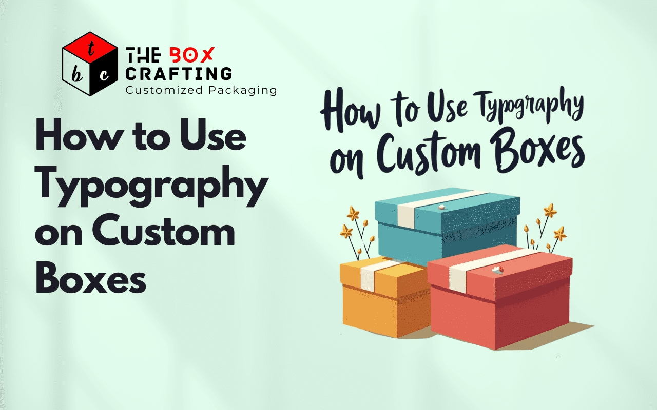
How to Use Typography on Custom Boxes
In today’s competitive market, packaging plays a significant role in how your products are perceived by customers. Custom boxes offer a unique opportunity to showcase your brand, communicate your product’s value, and stand out from the crowd. One of the key elements of packaging design that can make a huge difference is typography.
Typography refers to the style, arrangement, and appearance of the letters, numbers, and symbols used in printed materials. On custom boxes, typography can serve not only an aesthetic function but also a functional one by communicating essential information clearly and effectively. In this article, we will explore how to use typography on custom boxes to create packaging that’s both visually appealing and effective in conveying your brand message.
Why Typography Matters on Custom Boxes
Typography is more than just a visual element of design. It sets the tone for your brand, establishes a connection with your audience, and influences purchasing decisions. When done right, typography on custom boxes can elevate your packaging from being merely functional to being an essential part of your brand’s identity.
Here are some reasons why typography is so important for custom box designs:
- Brand Identity: Typography is one of the most recognizable elements of a brand. A consistent typographic style across all your packaging helps reinforce your brand identity and create a memorable impression.
- Legibility and Readability: Custom boxes often have limited space for text. The choice of typeface and how you arrange the text will directly impact the readability of important product information, such as ingredients, usage instructions, or brand messages.
- Appealing to Emotions: Typography can evoke emotions. Whether it’s bold and modern or elegant and classic, the right typography can attract your target audience and set the right mood for your product.
- Differentiation: In a crowded market, packaging that stands out is crucial. Typography can help differentiate your product from competitors and give it a unique character that resonates with consumers.
Choosing the Right Typeface for Your Custom Boxes
When it comes to typography on custom boxes, the typeface you choose is critical. Different typefaces convey different messages, so it’s important to choose one that aligns with your brand’s personality and the nature of your product. Let’s break down the key aspects of choosing the right typeface for your packaging.
- Serif vs. Sans-Serif: Serif fonts, like Times New Roman or Georgia, have small lines or embellishments at the ends of the strokes, while sans-serif fonts, like Arial or Helvetica, do not. Serif fonts often have a more traditional or formal feel, while sans-serif fonts tend to be more modern and clean.
- Serif fonts can work well for luxury or traditional products.
- Sans-serif fonts are more suitable for modern or minimalistic designs.
- Custom Fonts: Many brands create custom fonts that reflect their unique style. If you want your custom box to stand out, consider using a custom typeface that reflects your brand’s personality and sets you apart from competitors.
- Readability: Above all, ensure that the typeface is easy to read, especially for product information. Avoid overly decorative fonts that may look stylish but could make the text hard to decipher, especially when printed on small boxes.
- Contrast and Hierarchy: Choosing a typeface that contrasts well with the background color of your custom box ensures that the text stands out. Additionally, creating a typographic hierarchy, where important information is in a larger or bolder font, helps guide the reader’s eye to the most crucial details.
Typography and Brand Consistency
Consistency in typography is key to building a strong and recognizable brand identity. The typography you use on your custom boxes should align with your overall brand guidelines, which include your logo, color palette, and other design elements. Using the same typography style across all your products creates a cohesive look and feel that customers will associate with your brand.
For example, if your brand is known for its minimalist, modern aesthetic, use clean, sans-serif fonts with plenty of white space. On the other hand, if your brand is more vintage or artisanal, serif fonts with decorative elements could be more fitting.
Tips for Typography on Custom Boxes
Here are some practical tips to ensure your typography enhances your custom box design:
- Keep It Simple: Less is often more when it comes to typography. Use no more than two or three typefaces on a single custom box to avoid visual clutter. Choose complementary fonts that work well together and maintain harmony.
- Focus on Readability: The primary purpose of typography on custom boxes is to communicate information. Choose fonts that are easy to read from a distance, especially if your boxes will be displayed in stores. Avoid using fonts that are too intricate or hard to decipher at small sizes.
- Use Typography to Highlight Key Information: Your packaging may include multiple elements, such as your product’s name, instructions, and brand message. Use typography to create a hierarchy by making key information stand out. Use bold, large text for your product name and smaller text for additional details.
- Experiment with Typography Pairings: If you want to be creative, experiment with different typography pairings. Combine a bold, attention-grabbing font with a simple, easy-to-read typeface for balance. For example, use a script font for the brand name and a sans-serif font for product details.
- Consider Packaging Size and Shape: The size and shape of your custom box play a role in how much text you can fit and how it will be read. If you’re designing smaller packaging, like Custom Card Stock Automotive Boxes, ensure the text is legible at smaller sizes. On larger boxes, you can afford to be more generous with the text size.
- Think About Your Target Audience: The typography you choose should resonate with your target market. A fun, quirky font might work well for children’s toys, while a clean, sophisticated font might be better for premium skincare products.
Common Typography Mistakes to Avoid on Custom Boxes
Even the most experienced designers can make mistakes when it comes to typography. To ensure your custom boxes are both beautiful and functional, here are some common typography errors to watch out for:
- Using Too Many Fonts: Sticking to too many fonts can make your design appear cluttered and disorganized. Limit yourself to one or two fonts to maintain a clean and cohesive look.
- Small or Hard-to-Read Fonts: Especially on smaller boxes, it’s tempting to use tiny fonts to fit in more text. However, if the text is too small to read easily, it will detract from your customers’ experience and might even cause them to overlook crucial information.
- Ignoring Hierarchy: If your typography lacks hierarchy, your design will appear chaotic and confusing. Be sure to emphasize important details by varying the size and weight of your fonts.
- Overuse of Decorative Fonts: While decorative fonts can look beautiful, they can also be hard to read if overused. Use these fonts sparingly and only for specific elements, such as product names or headlines.
Typography on Custom Boxes for Different Industries
Typography on custom boxes varies greatly depending on the type of product being packaged. Let’s look at how typography can be tailored for different industries:
- Luxury Products: For high-end products, typography should reflect sophistication and elegance. Consider using serif fonts with fine details or custom fonts that convey exclusivity. Colors like gold, silver, or black can enhance the typography and give the packaging a luxurious feel.
- Food and Beverages: Packaging for food products often requires a clear, easy-to-read typeface. Typography should communicate freshness and quality, and it should also comply with any legal requirements for ingredient lists and nutritional information. For example, bold sans-serif fonts are often used for food packaging to make the text stand out.
- Automotive Products: For automotive products like Custom Card Stock Automotive Boxes, typography should be bold and strong to convey durability and reliability. A clean, sturdy sans-serif font works well for this type of packaging. The color choices should complement the industrial or technical nature of the product.
- Cosmetics and Skincare: Beauty products benefit from elegant and delicate typography. Fonts that are clean, refined, and graceful will attract customers looking for high-quality skincare or cosmetics. Serif fonts often work well, but you can also experiment with unique custom fonts that express the luxury of the brand.
Conclusion: Typography is Key to Effective Custom Packaging Design
Typography on custom boxes is more than just an artistic choice—it’s an essential part of your product’s packaging design. By choosing the right typeface, ensuring legibility, and aligning with your brand’s identity, you can create custom boxes that are not only beautiful but also functional and effective in communicating your product’s message. Whether you’re using Custom Card Stock Automotive Boxes or packaging for another industry, typography plays a central role in building a cohesive and impactful design.
At TheBoxCrafting, we specialize in creating custom packaging solutions that stand out. Our expert designers can help you incorporate typography seamlessly into your packaging to ensure that your product catches the eye and communicates your brand’s values clearly.
FAQs About Typography on Custom Boxes
- What type of font is best for custom packaging? The best font depends on your brand’s personality and the product you’re packaging. For a modern, clean look, sans-serif fonts are a great choice, while serif fonts are more traditional and elegant. Custom fonts can also be an excellent option for unique brand identity.
- How can typography enhance my brand’s identity? Typography can communicate the essence of your brand. The choice of font style, weight, and arrangement reflects your brand’s tone, whether that’s professional, fun, luxurious, or minimalist.
- Can typography help improve readability on custom boxes? Yes! Choosing clear, legible fonts, and establishing a strong typographic hierarchy ensures that important information stands out and is easy to read on any size packaging.
- What are some common mistakes to avoid with typography? Some common mistakes include using too many fonts, opting for small text sizes, and neglecting the importance of a clear typographic hierarchy. These errors can make your packaging look cluttered and difficult to read.
- How can I ensure my typography is eco-friendly? At TheBoxCrafting, we use eco-friendly materials for our custom packaging. When designing typography, opt for high-quality printing techniques that minimize waste and ensure clarity without compromising on style.
By following these guidelines and leveraging the power of typography, you can elevate your custom boxes to a new level of design excellence. Reach out to us at TheBoxCrafting to get started on creating custom packaging that makes a statement.
Leave a Reply